Explore Our Work
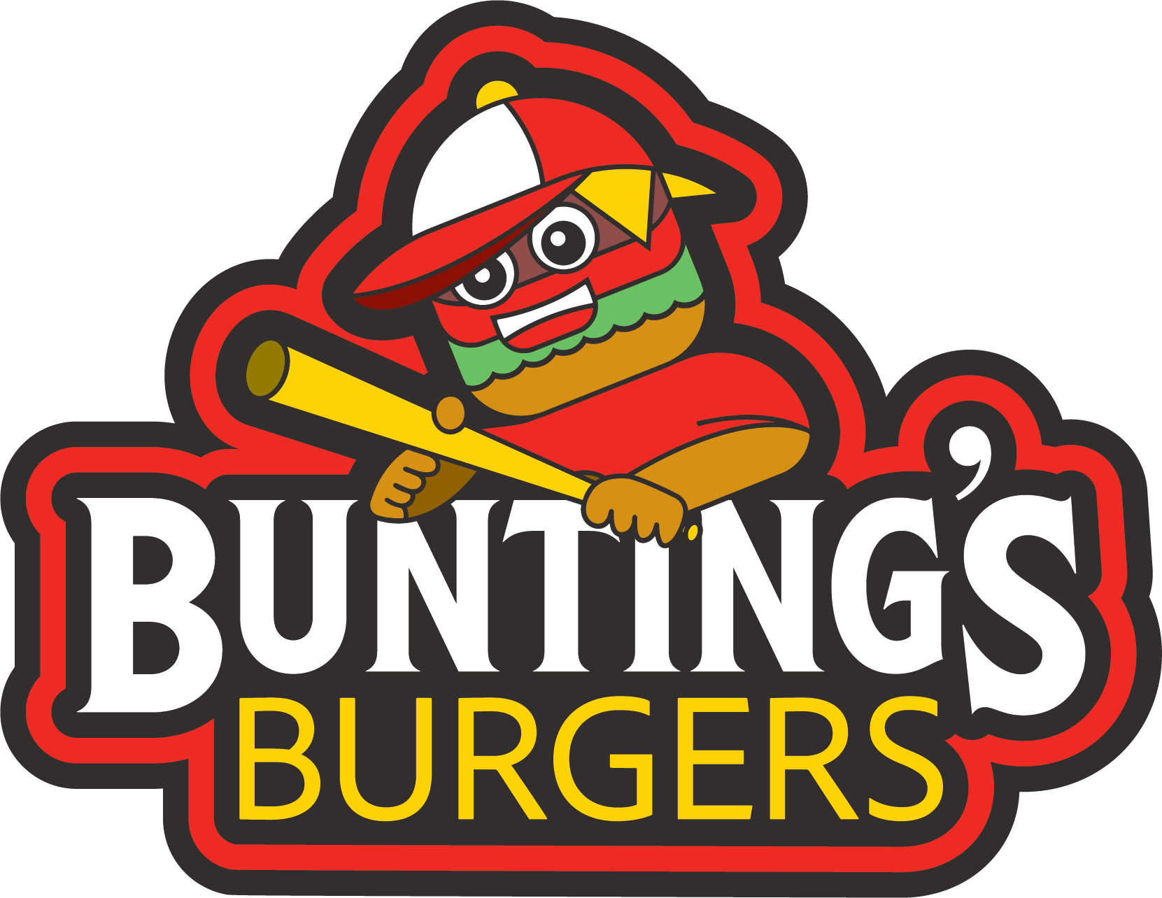


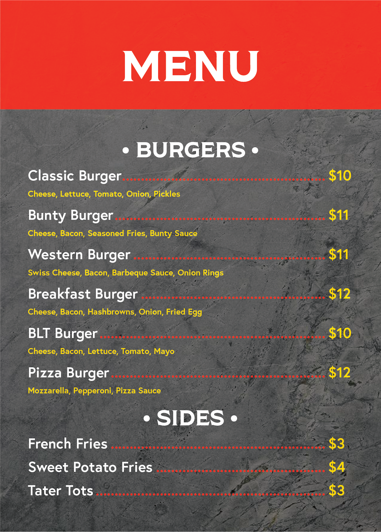


BUNTING'S BURGERS
Challenge:
Develop a captivating brand concept for a mobile culinary venture that transcends the traditional food truck experience.
Solution:
Named after the owner, Bunting’s Burgers is the result of a love of burgers, fries, and baseball. With the vision of a mobile ballpark experience for burger lovers in mind, the only correct choice was to combine baseball and burgers together. The mascot “Mr. Bunty” was born giving a recognizable and fun identity to the brand. Incorporating Mr. Bunty with a bright and exciting color scheme combines to create a neon sign look and a ballpark feel.
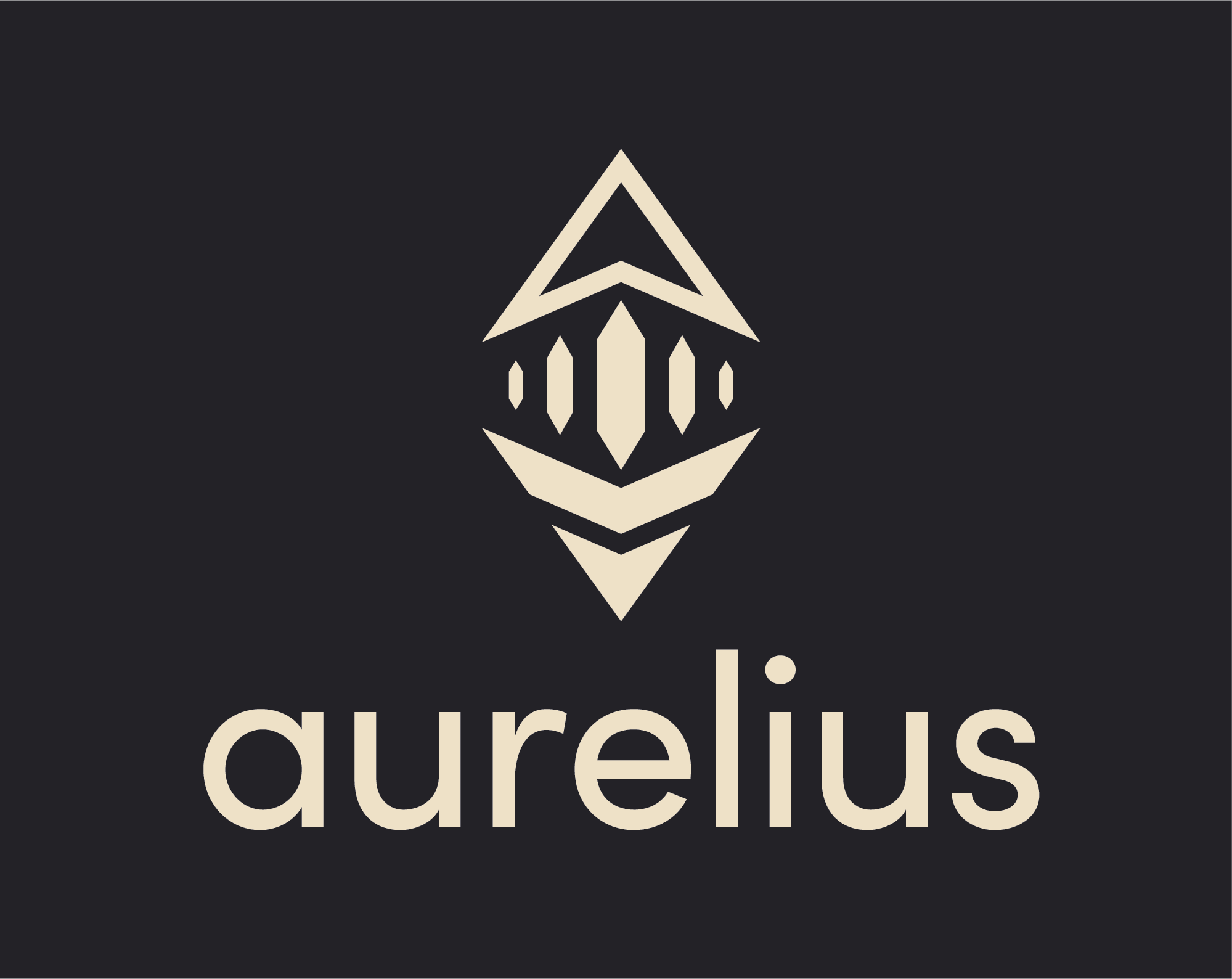

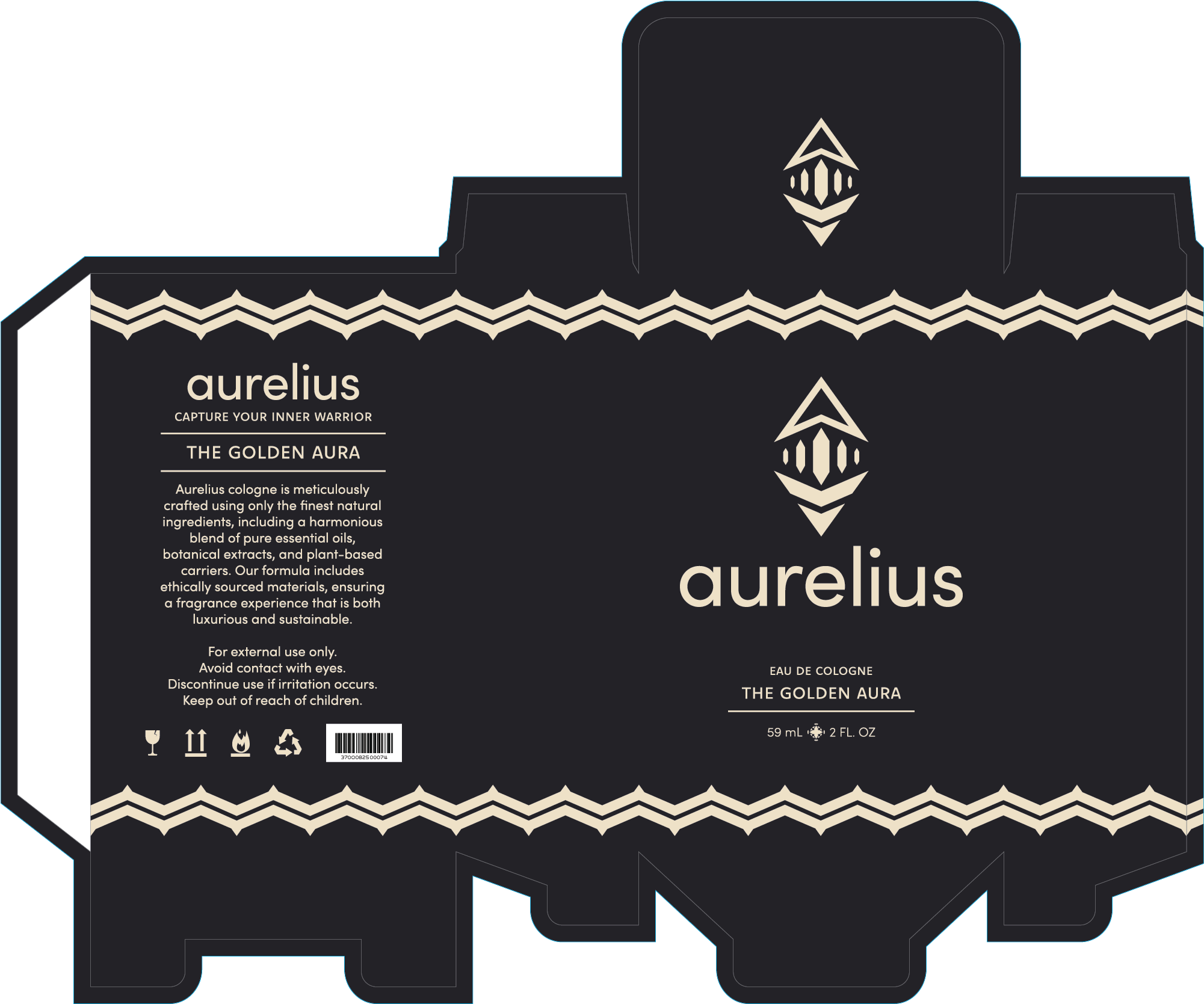

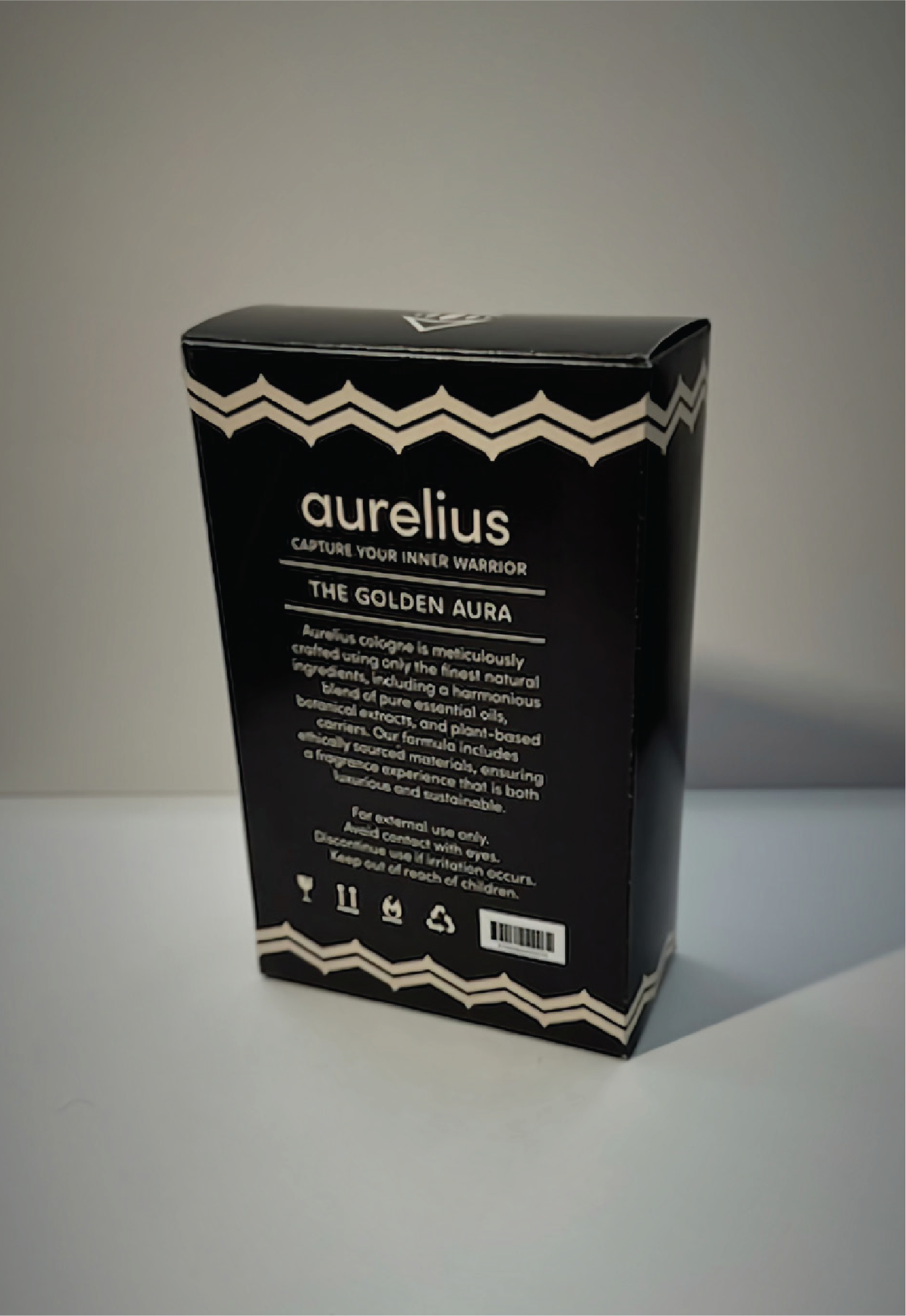

AURELIUS COLOGNE
Challenge:
Create a captivating brand identity and packaging design for a cologne brand that celebrates the warrior spirit within each individual.
Solution:
Aurelius, “the golden aura,” is more than just a cologne; it’s a symbol of resilience, courage, and determination. Inspired by the resilient spirit of warriors from diverse cultures and eras, Aurelius seeks to imbue wearers with a sense of strength, confidence, and empowerment.
Brand Identity:
Develop a captivating brand concept for a mobile culinary venture that transcends the traditional food truck experience.

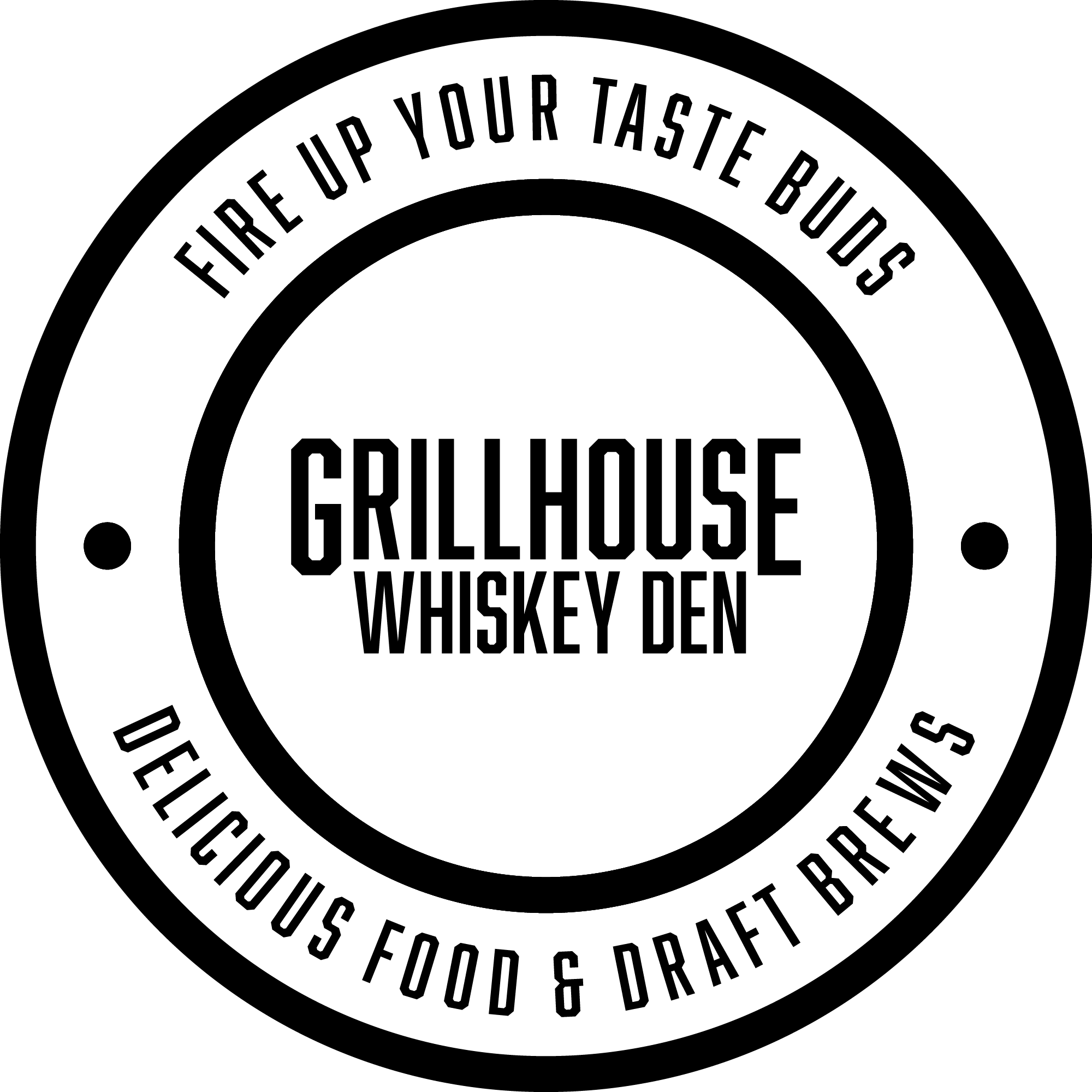

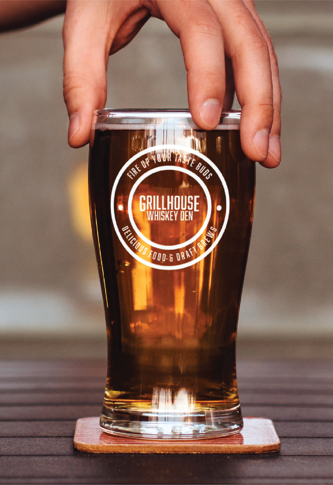

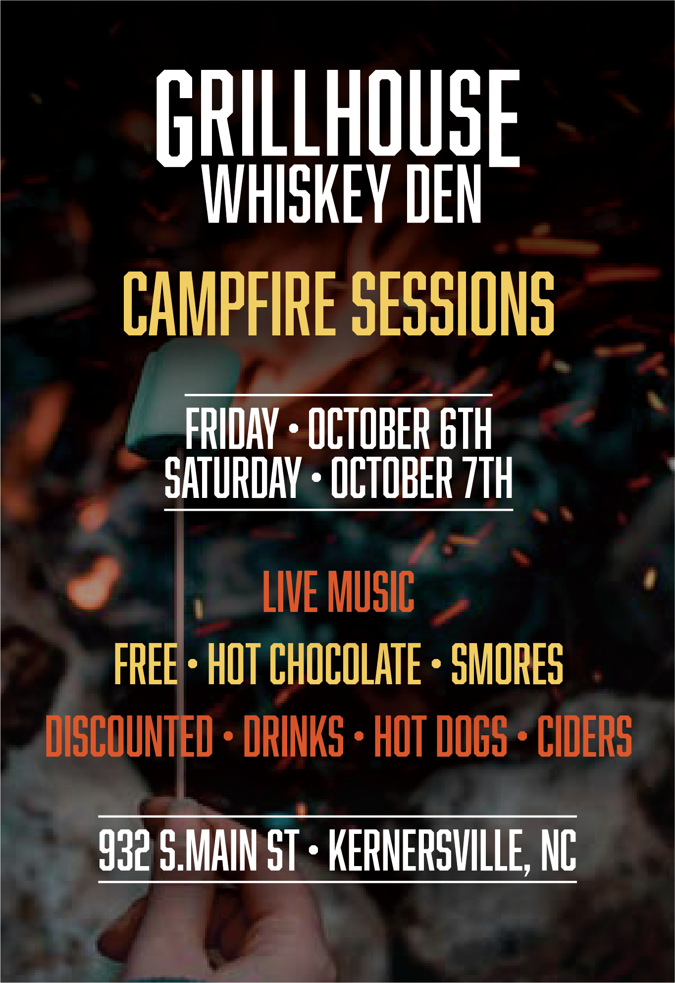
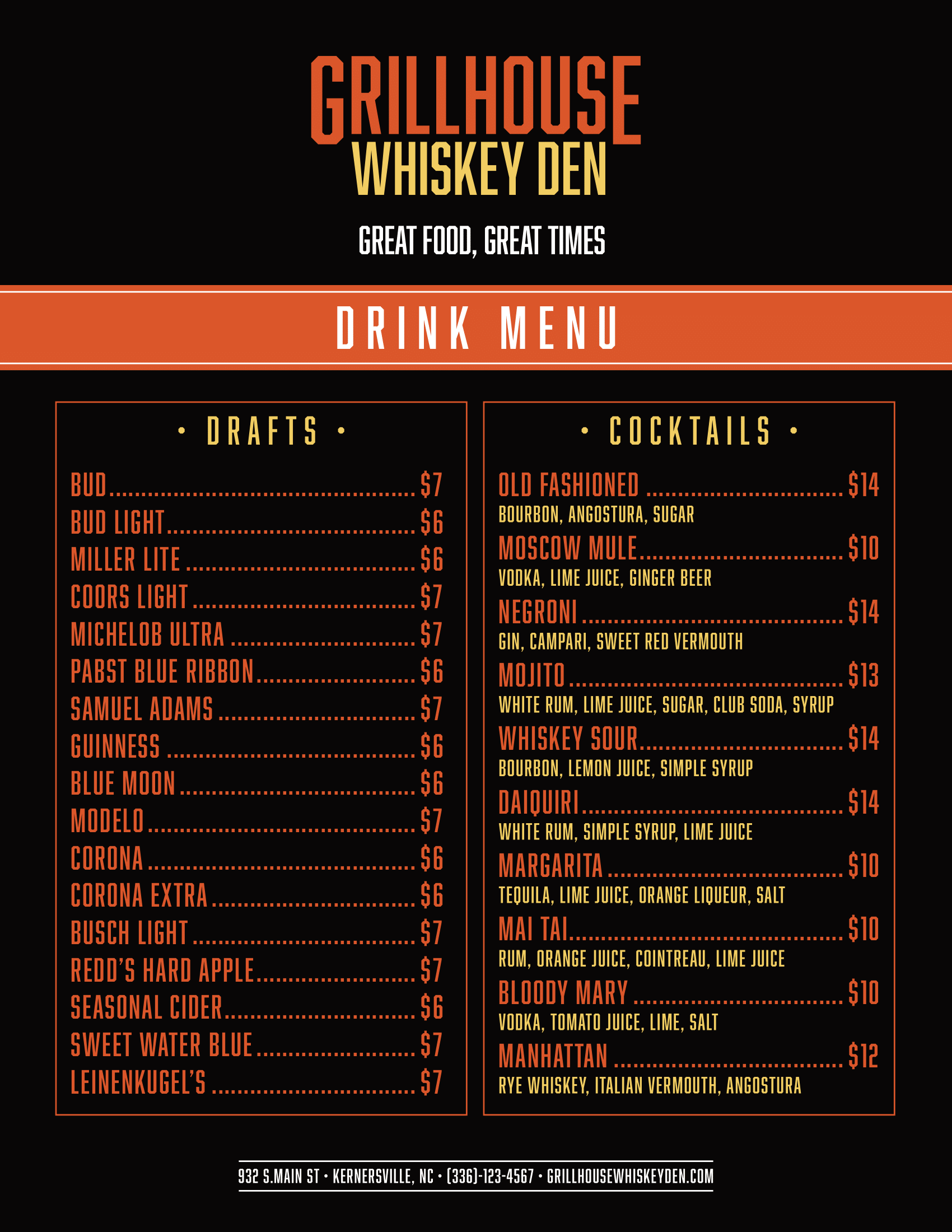
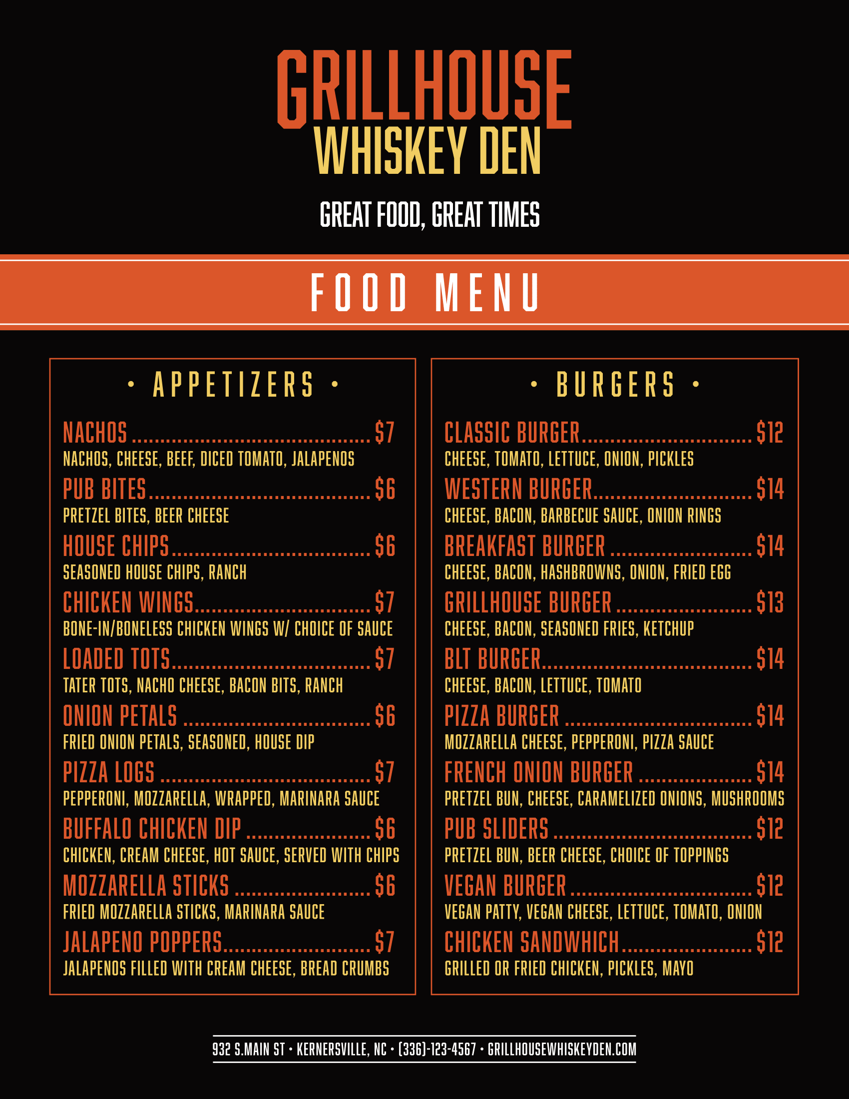
GRILLHOUSE WHISKEY DEN
Challenge:
Create cohesive branding materials for Grillhouse Whiskey Den that communicate its unique identity, showcase its offerings, and engage patrons effectively across various touchpoints, from the logo to event flyers and menus. The design should capture the tone of the establishment and resonate with its target audience, inviting them to experience the distinctive visuals and flavors of Grillhouse Whiskey Den.
Solution:
The design goal for Grillhouse Whiskey Den was to showcase its warm and inviting environment in a way that is exciting yet relaxing at the same time. The bold typeface and bright colors bring attention to those walking/driving past and the smell of the food draws them in. The Campfire Sessions perfectly capture the experience Grillhouse wants all of its customers to feel when spending time there. Whether you’re eating great food, having a few drinks with your friends, sitting around a campfire and listening to music, Grillhouse is the place to be.
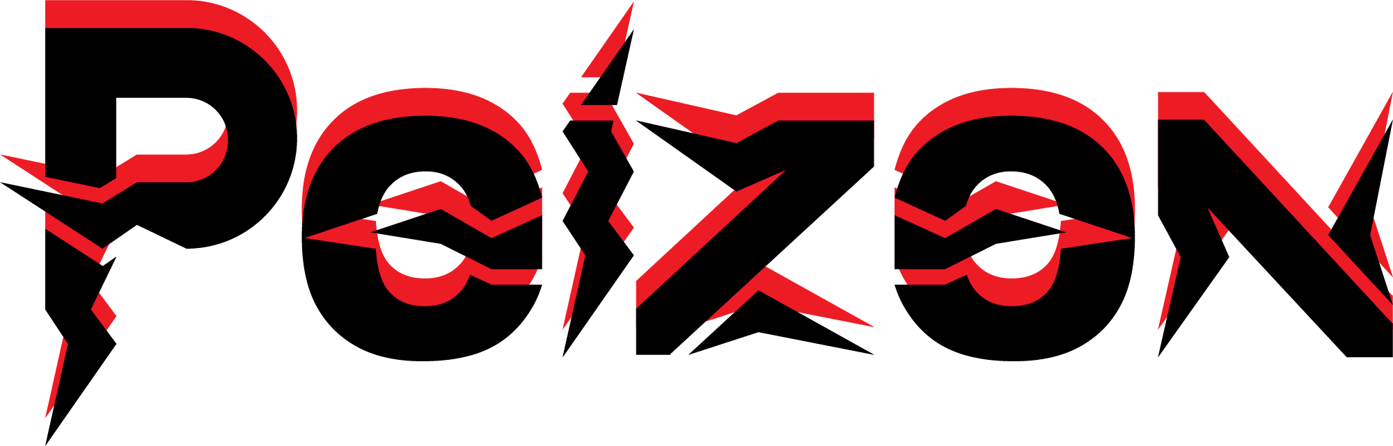

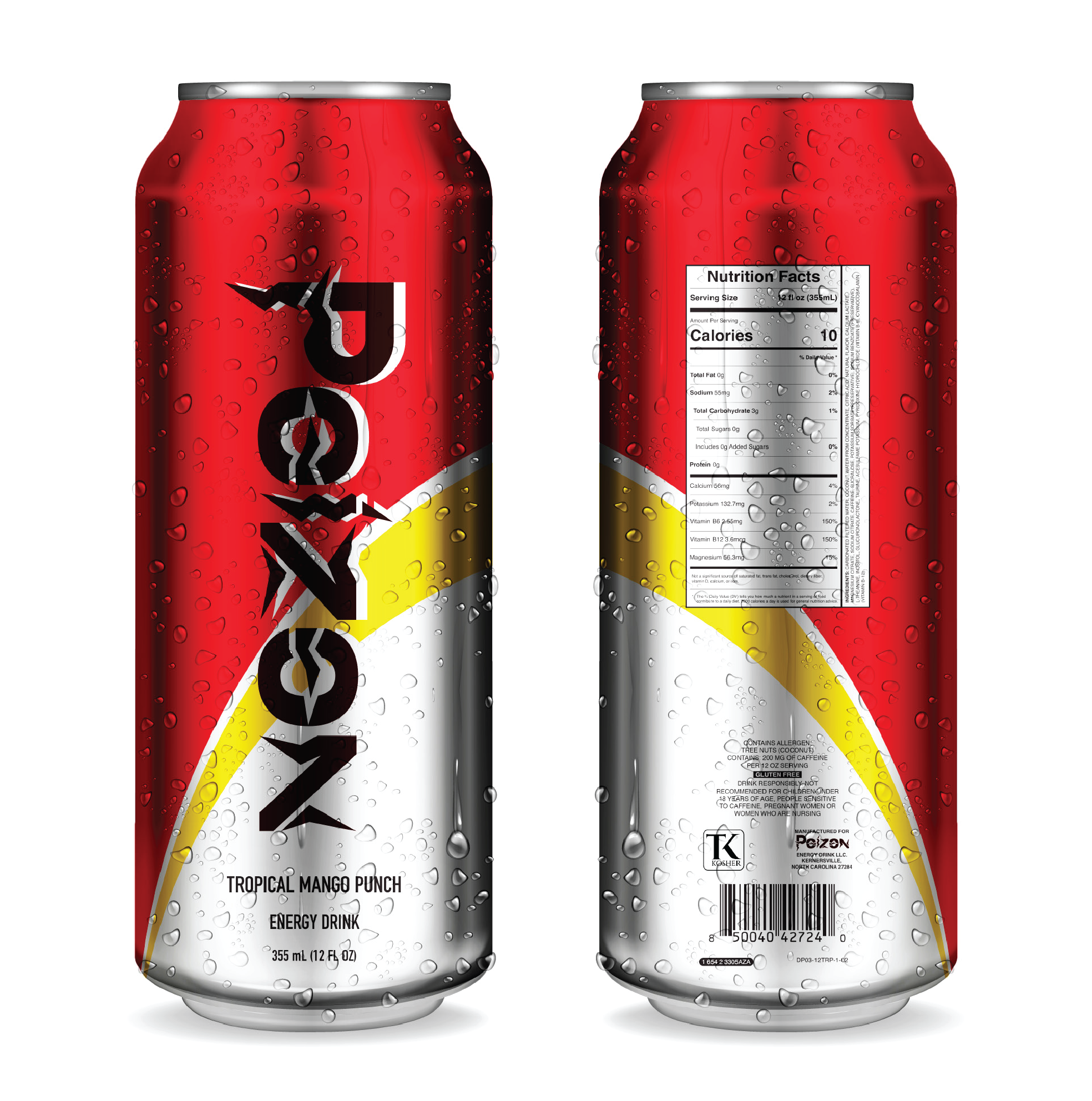

POIZON ENERGY
Challenge:
Create cohesive branding materials for Grillhouse Whiskey Den that communicate its unique identity, showcase its offerings, and engage patrons effectively across various touchpoints, from the logo to event flyers and menus. The design should capture the tone of the establishment and resonate with its target audience, inviting them to experience the distinctive visuals and flavors of Grillhouse Whiskey Den.
Solution:
Inspired by the vibrant energy and dynamic character of the brand, my aim was to craft a captivating logotype that would effortlessly command attention and set Poizon apart from its competitors. For the label and packaging design, I envisioned allowing the logo to take center stage, harnessing its visual impact to speak volumes. Embracing a diverse color palette tailored to each individual flavor, rather than adhering to a uniform scheme, was the key to creating a truly immersive experience for the customer. This approach not only ensures each product stands out with its own distinct identity but also entices customers to collect multiple offerings, drawn in by the allure of each unique design
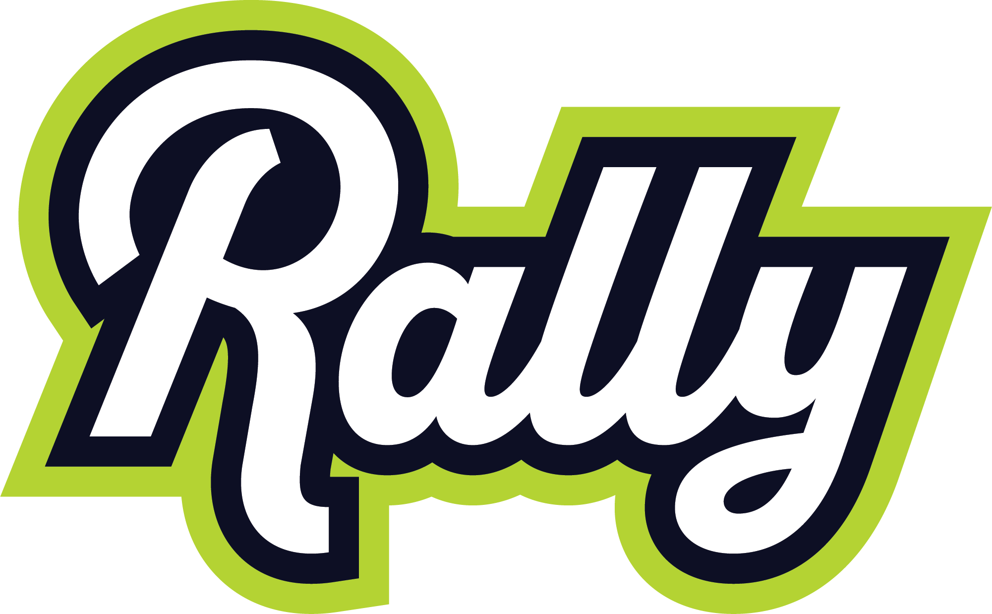

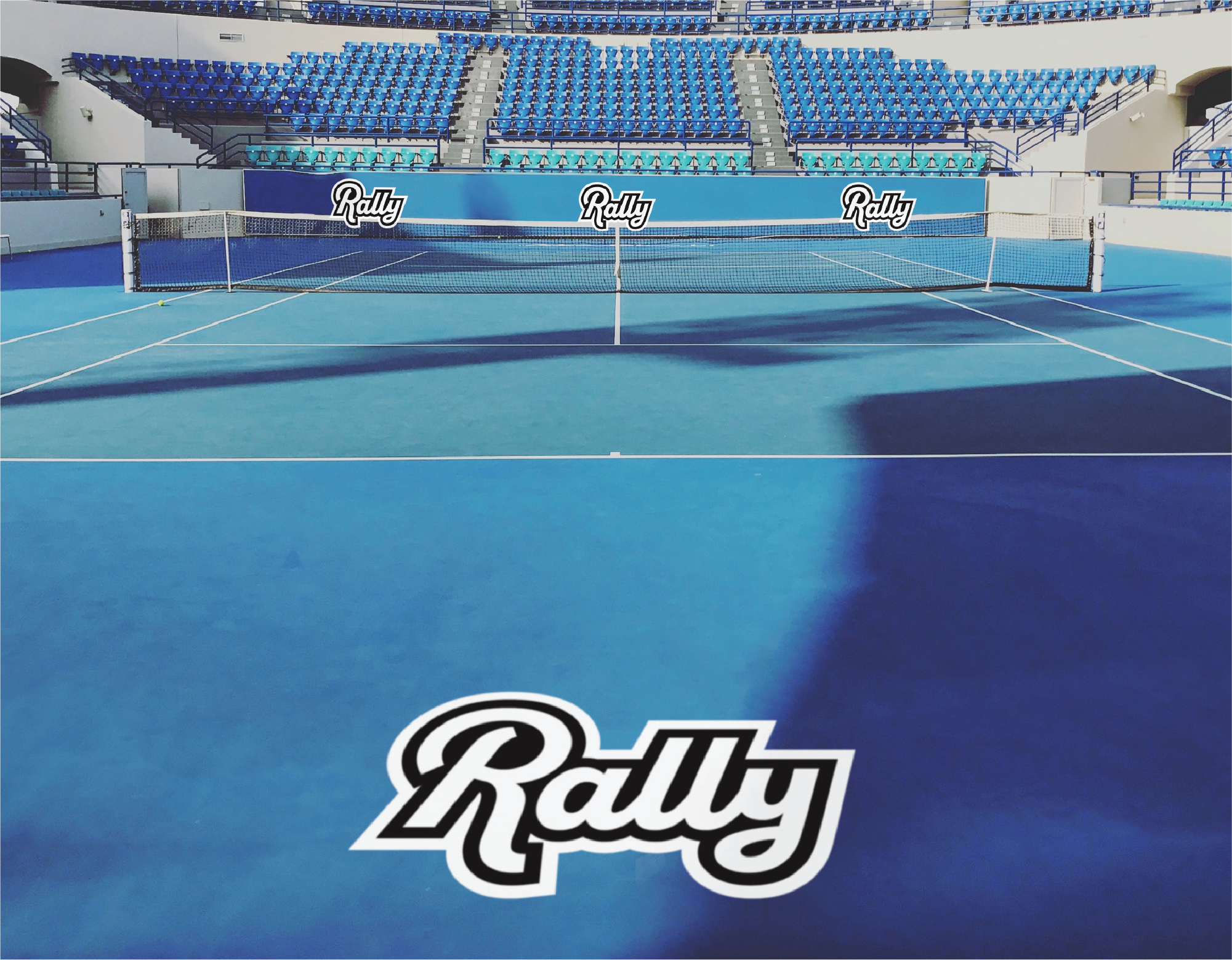

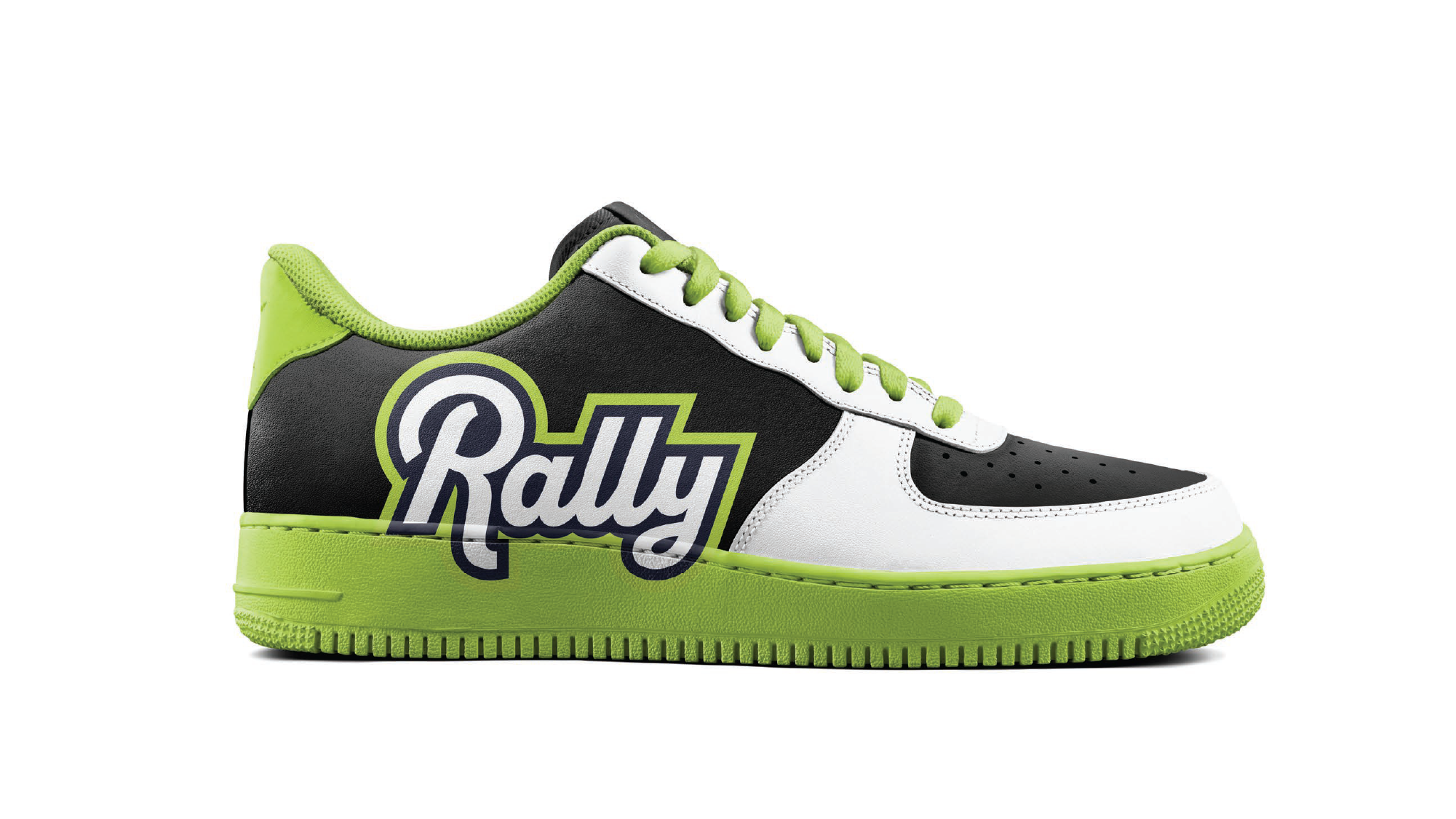
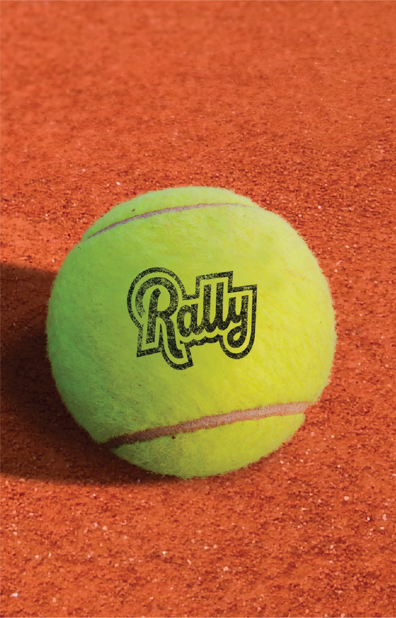
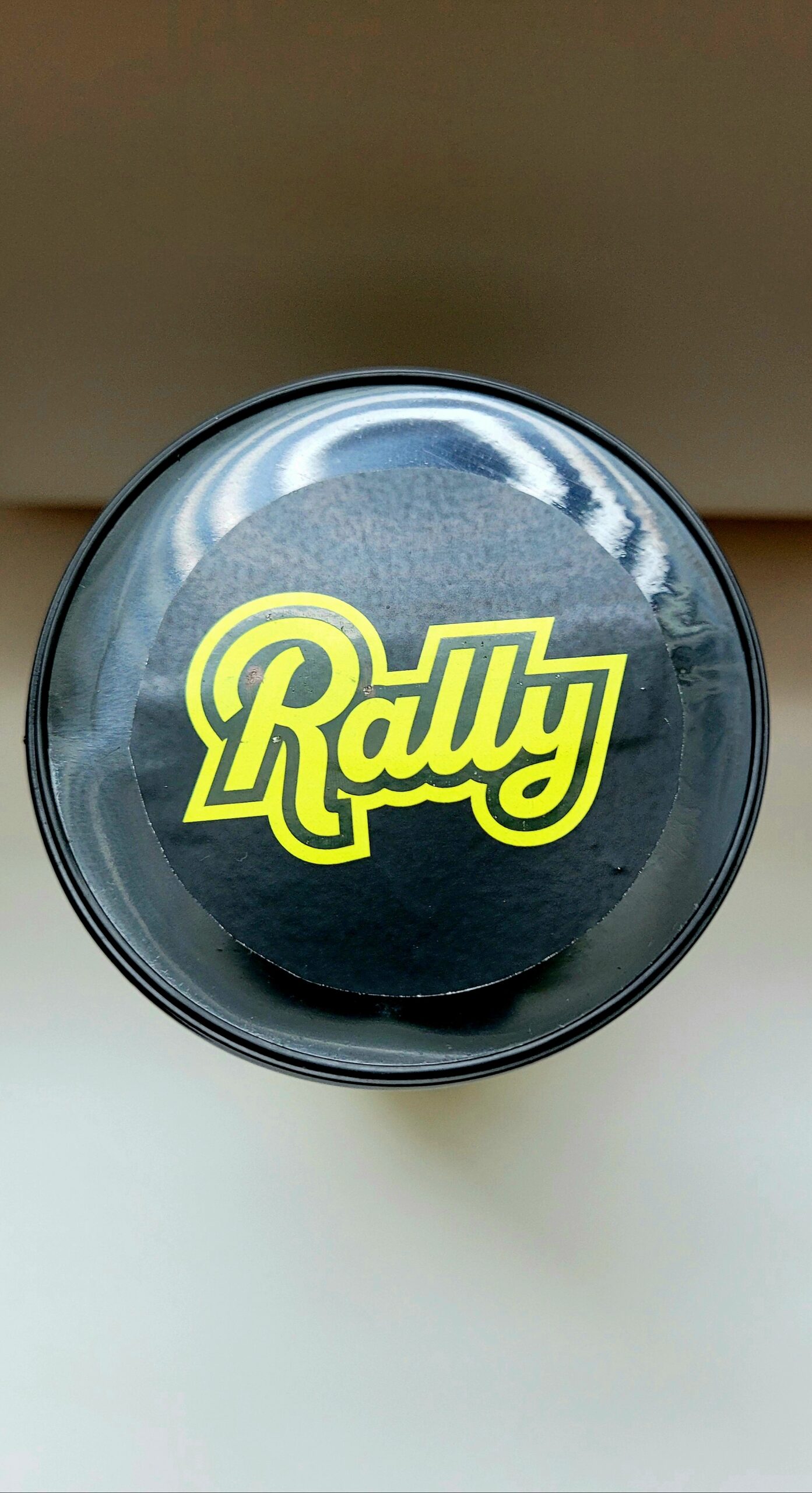
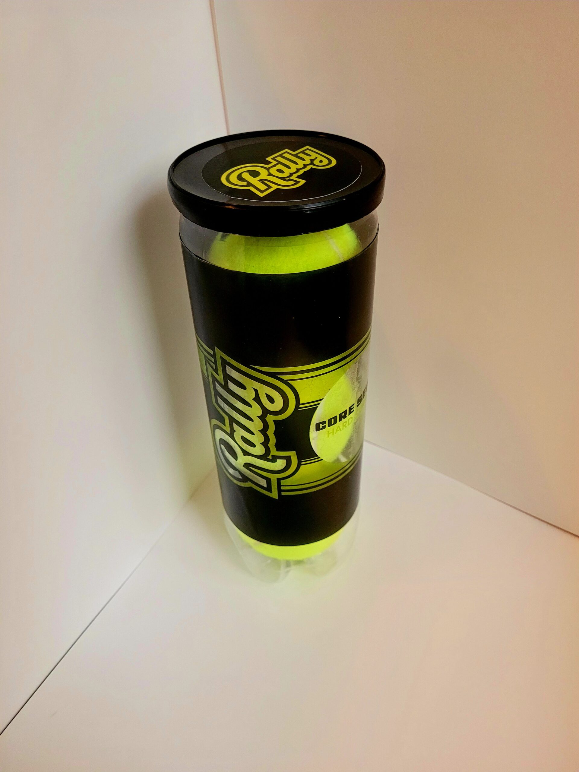

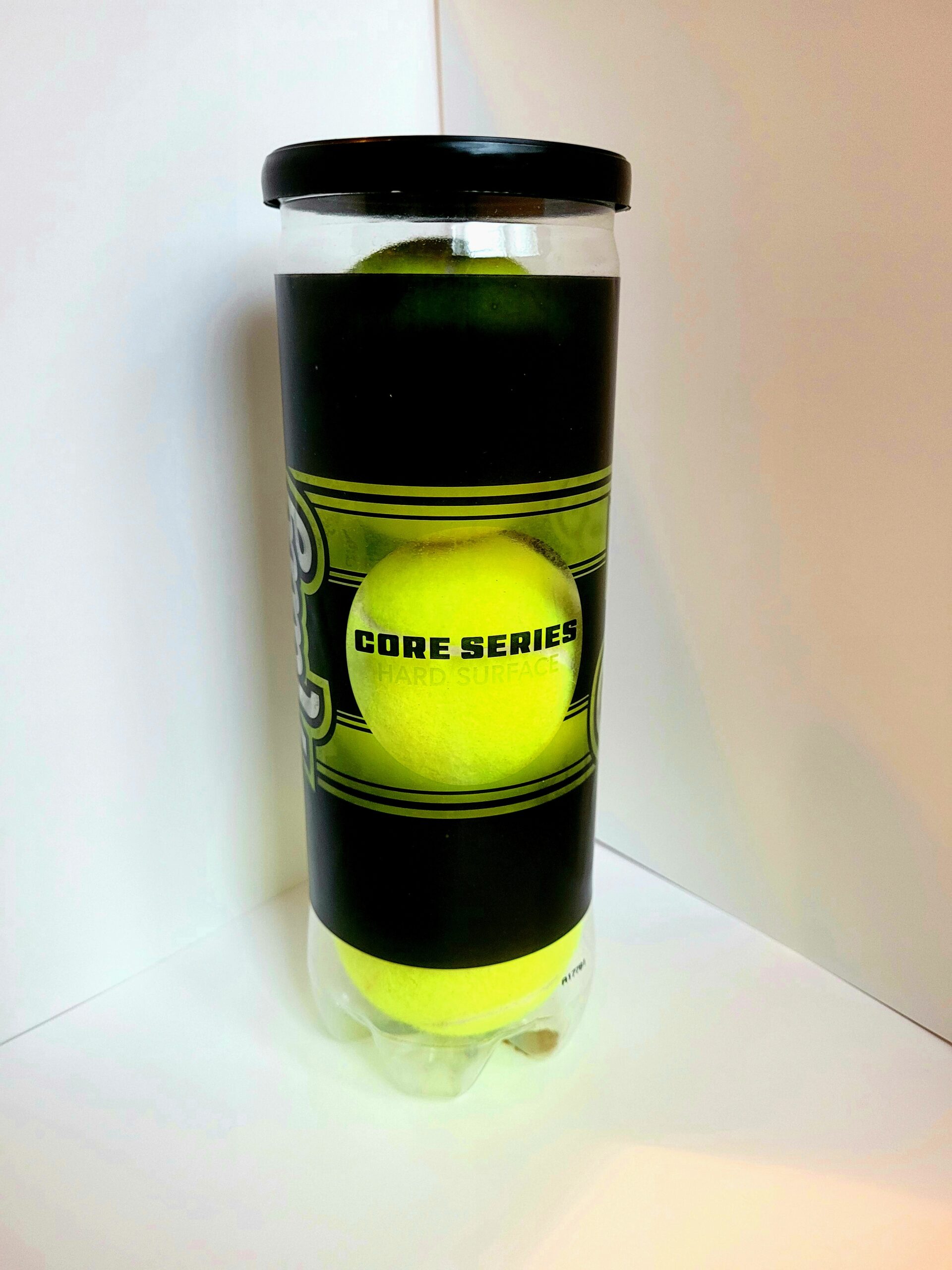
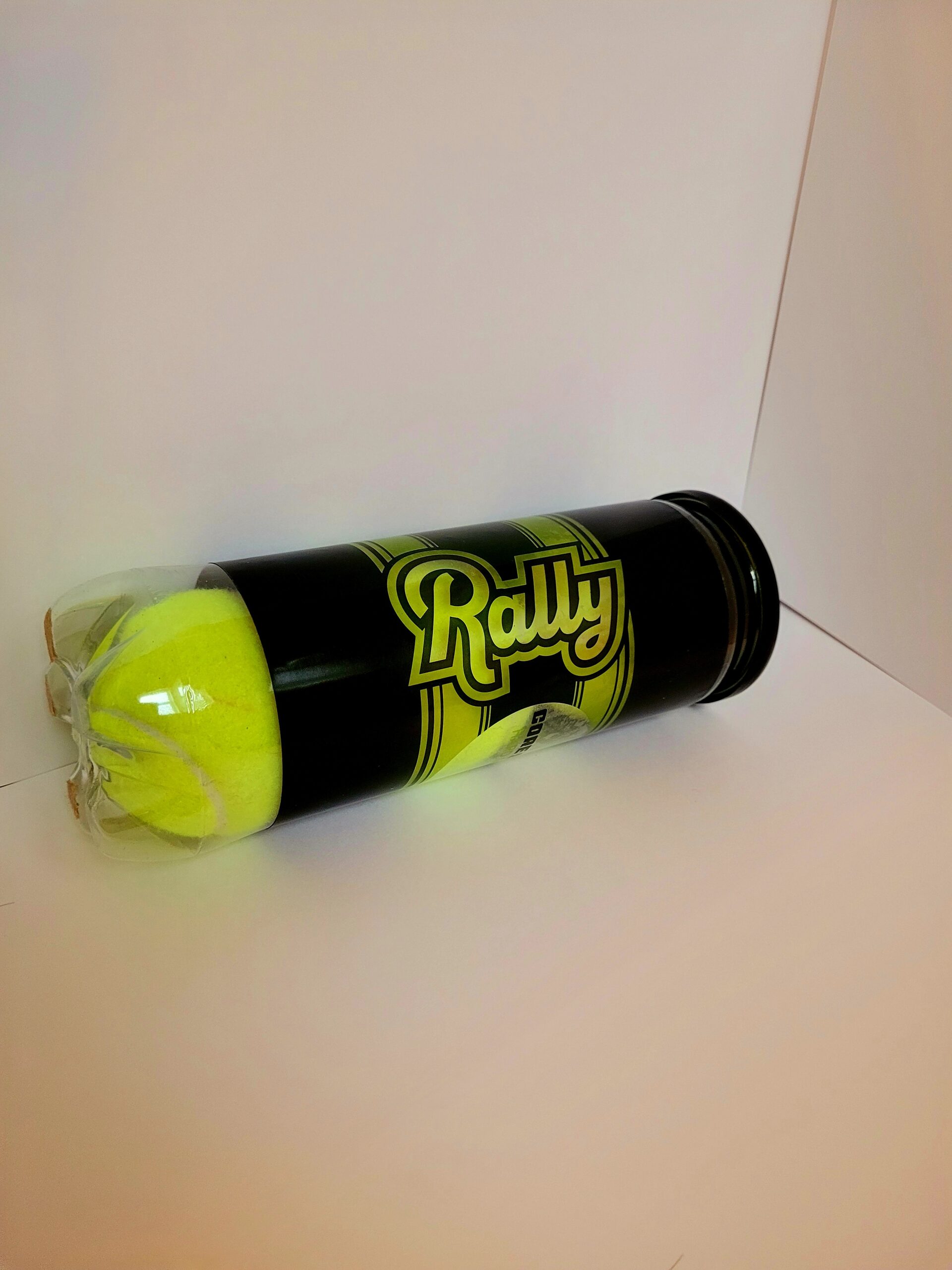
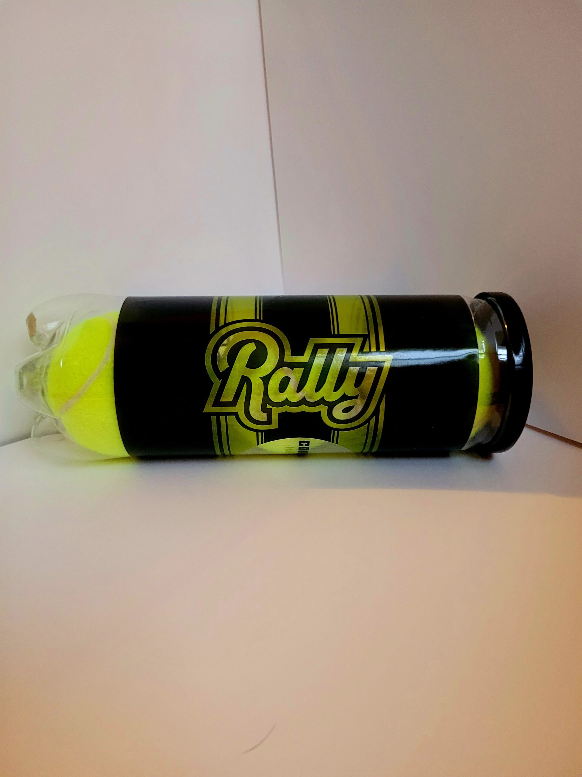
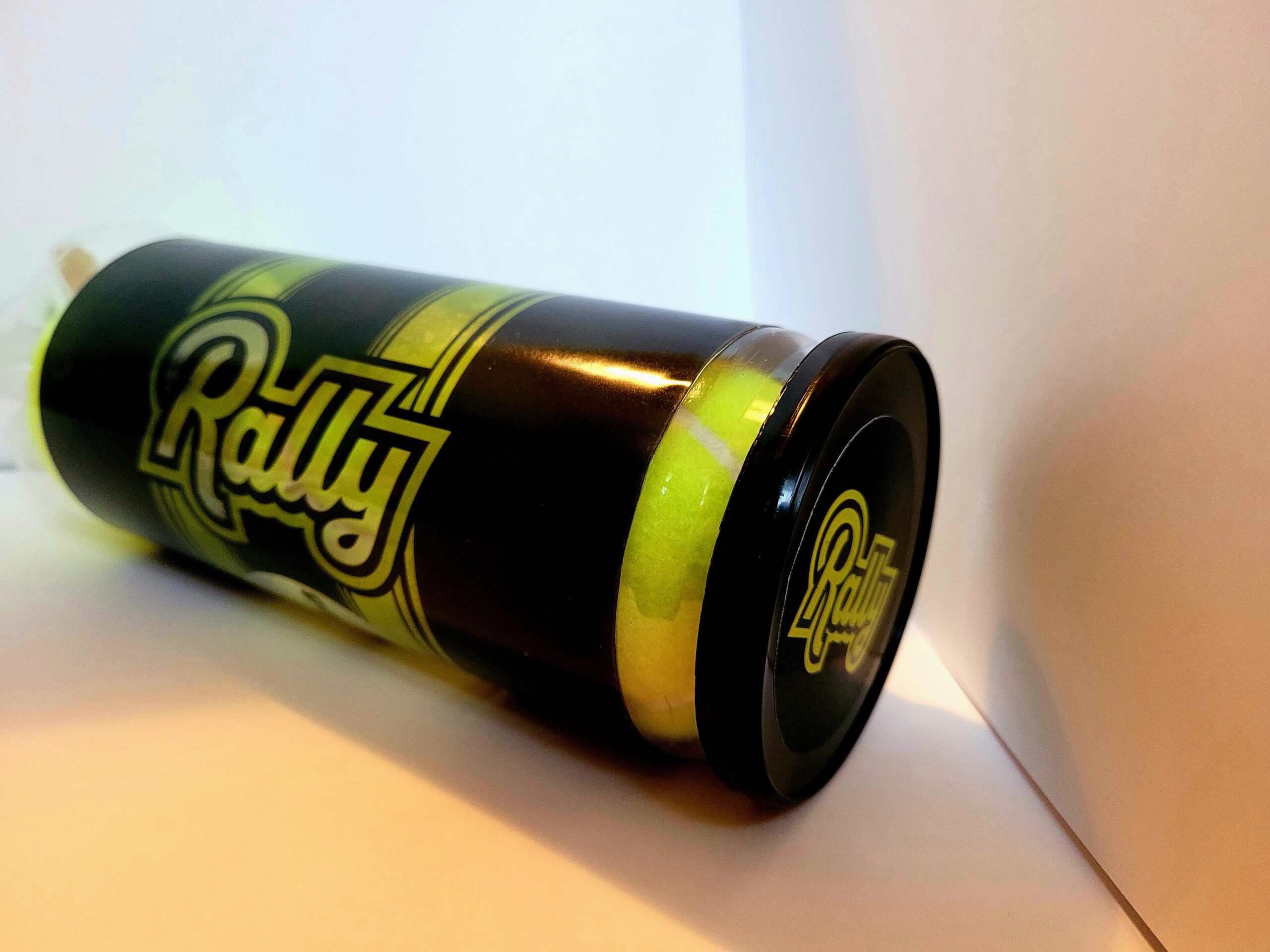
RALLY TENNIS ESSENTIALS
Challenge:
Create a comprehensive branding strategy that positions the brand as a leader in the tennis industry. By focusing on innovation, performance, and style across logo design, apparel, tennis essentials and more. Rally aims to inspire and empower tennis enthusiasts to elevate their game and embrace the thrill of the sport.
Solution:
Rally’s strategy hinges on a standout logo that exudes trust and familiarity for tennis players. I crafted a vintage-modern wordmark blending athleticism and approachability, giving the brand a timeless yet fresh appeal. The color palette, with its classic black and white complemented by a vibrant green reminiscent of tennis balls, sets Rally apart from competitors while paying homage to the sport’s iconic imagery. This cohesive branding positions Rally as a trusted and enduring presence in the tennis world.

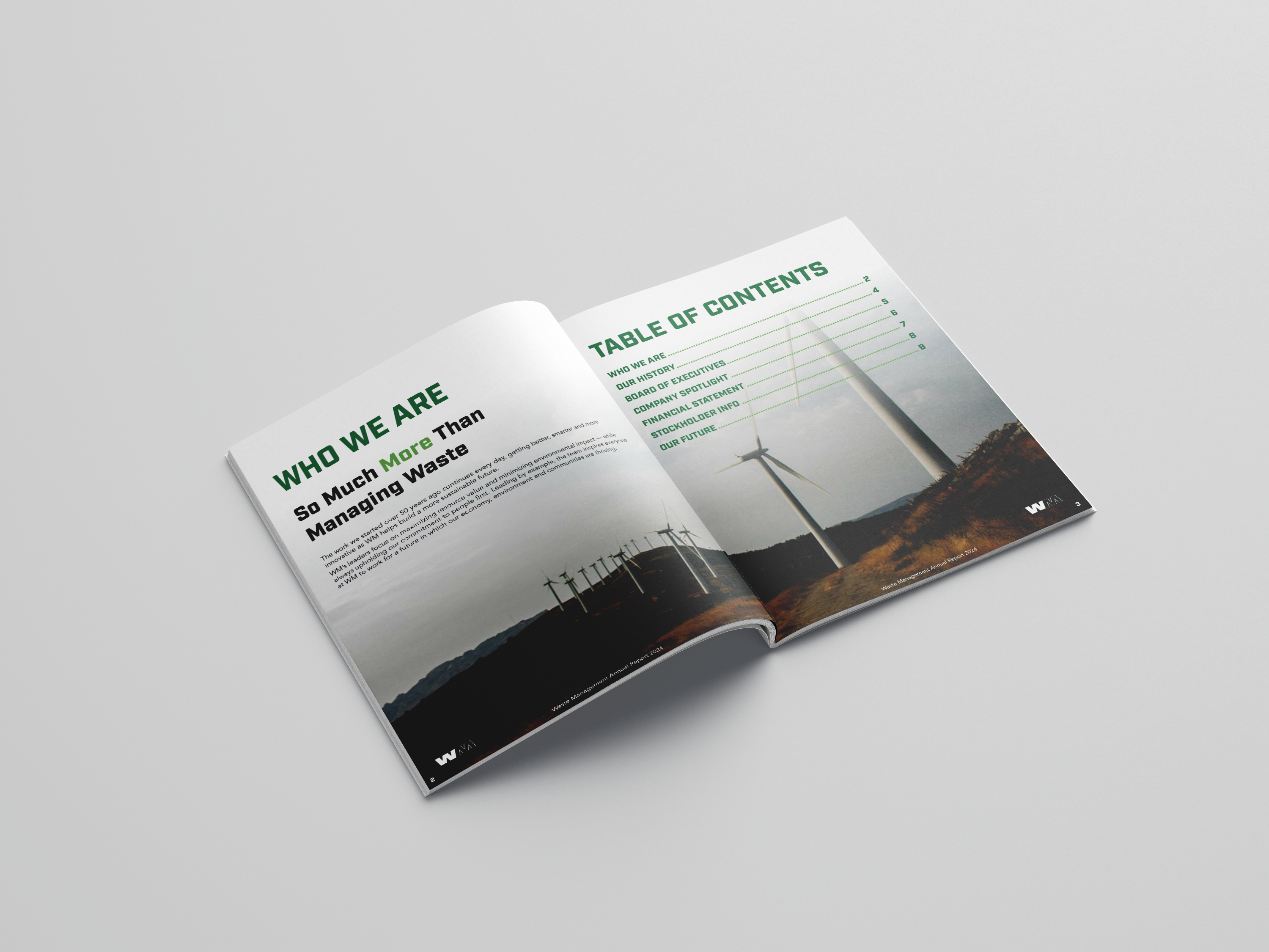
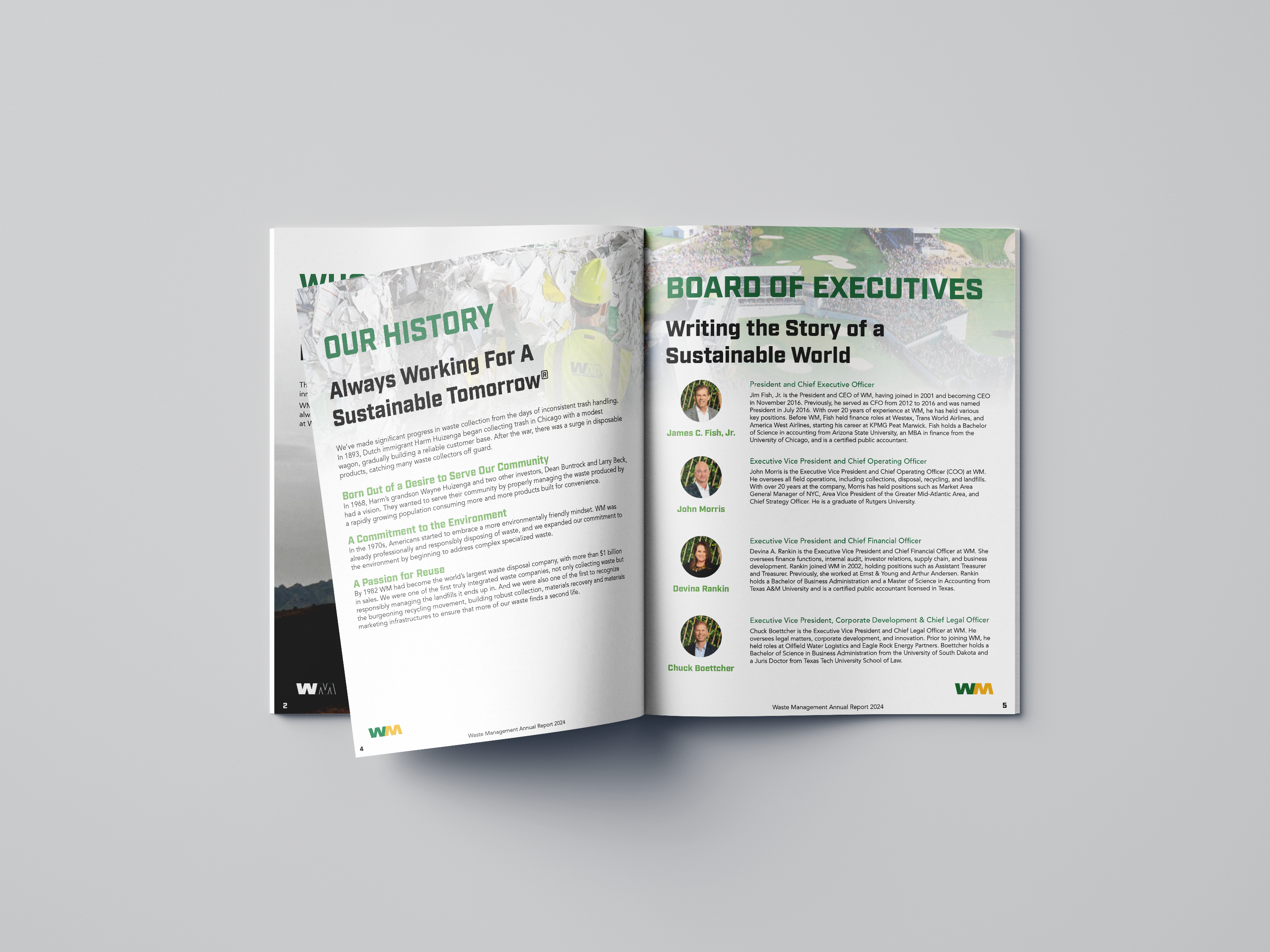

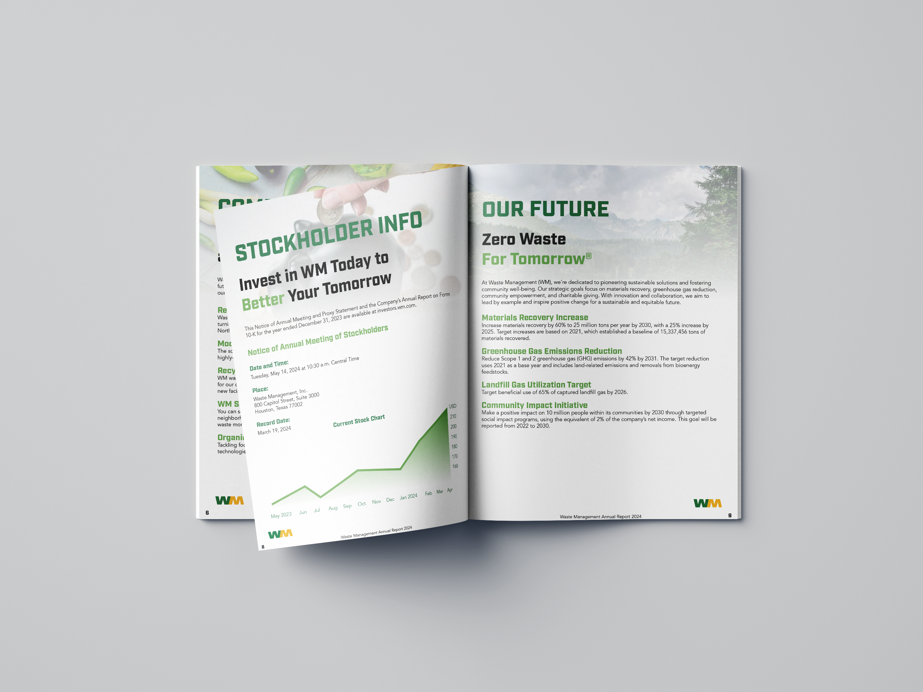


WM ANNUAL REPORT 2024
Challenge:
Craft a compelling annual report leveraging the established branding of a company to encapsulate one of its prominent campaigns or ongoing initiatives. Curate a comprehensive ten-page document meticulously showcasing the essential elements of the company’s annual report, including its core requirements and rich content.
Solution:
Waste Management, now referred to as WM, has shed its traditional image of merely managing waste. Embracing the ethos encapsulated by the slogan “Always Working For A Sustainable Tomorrow®,” WM is now focused on a broader mission. This annual report aims to spotlight the multifaceted strategies through which WM intends to fulfill this commitment. Through a harmonious blend of captivating imagery and compelling text, this report endeavors to portray WM’s pivotal role in fostering sustainability, both nationally and globally.
Like What You See?
Get in touch with us today so we can help assist you with your creative needs!